Wednesday, 22 September 2010

TOTAL FILM - August 2010


·      Like the majority of other film magazines, this front cover of total film follows the codes and conventions of movie magazines.
·      The first thing to notice with this front cover is the title. The title is not as it would normally be. It is in the same place but is transparent and has a cracked, broken effect on it. This tells the audience about the genre of the film that is featured on the front cover. Cracked glass is something that is often associated with films of the action genre, and so we as an audience understand that salt is an action film.
·      The main character has a central position on the front cover to tell us that she is important and most likely central to the film plot.
·      As well as this, the warm orangey colours contrast with the dark and pale colours of the woman, as a result there is a contrast between hot and cold and the character is depicted to look cold, this may offer an insight into her roll in the film, but it also tells the audience about the genre of the film again.
·      The white titles, especially of ‘angelina jolie’ and ‘salt’ contrast greatly to the dark backgrounds I order to stand out and to be obvious to the audience.


EMPIRE - April 2007


·      This is the front cover of another EMPIRE magazine. It follows the codes and conventions of magazine front covers in that, the mast head is big, bold and at the top of the page, the cover lines are down the sides of the page, and the main cover line is slightly larger and in bold. There is also a strap line along the bottom. This is something I will need to copy in my magazine.
·      The photograph on this front cover tells us a lot about the genre if the magazine itself. We can see from the use of effects and streaks of light that it is an action/sci-fi film. The bright colours attract your attention and make you look at the magazine.
·      The way in which the light surrounds the protagonist makes him almost appear godly and therefore important. The audience understands that this character is central to the film and may even be a symbol of hope.
·      The fact that the ‘silver surfer’ is flying over a city at night is almost a cliché of an action or superhero movie, and tells the audience a lot about the genre of the film.

The Dark Night Poster


The poster above is for a film called ‘the dark knight’, which is an action/sci-fi film.

  •  The most obvious thing to notice about this film poster is the lack of colour that is used. The dark background is often something we see on film posters, but the paleness of the main picture really highlights the lack of colour. This evokes the image that this character is evil or the ‘bad’ person in the film. It also creates the idea of coldness, with the pale cool colours that are used.
  •     The shading around the main image also help to evoke the evil and cold idea, which tells the audience that there is something strange about this individual.
  •      The card with another character on is much smaller and as a result, the audience are lead to believe he is less important or maybe there is something about special about him.
  •    The way in which the main picture us famed leads us to believe that the joker is showing us a picture of batman in order to tell us something, which represents this idea of some kind of connection between the two characters, but in what way they are connected we do not know.
  •       The poster follows most of the normal codes and conventions of film posters, in the way that the title is clear and found at the bottom of the page, and the names of actors are across the top.

The Expendables - Trailer Analysis

The link to the Trailer can be found below:

http://www.youtube.com/watch?v=zFFXGxhyRDo

'The Expendables' is a classic action film, filled with explosions guns and fights. The idea behind the trailer is to portray this, so that the target audience is aware and go to watch it.


  • We a shown in the trailer that there will be action scenes filled with huge explosions and gun fights, and this tells the audience what genre the film is and therefore whether it would suit them. Screen shots of these can be seen below:


  • The first thing that you notice when watching the trailer is the amount of big name actors who star in it and will be widely recognised. This is a major selling point of the film and will bring in huge audiences, as a result this is something that the trailer plays on. It wants everyone to know that this is a huge action movie classic where many big name actors come together, many for the first time. We are introduced to the characters one by one using consecutive close ups of their faces. However in all cases only half the face is visible, which adds a mysterious aspect to the film. It is almost saying that these actors are so famous that you only need to see half of their faces to recognise them. I have taken a few screen shots of these close ups and then can be found below.


As you will notice, in each case half of the face in in shadow. This also adds a darker side to the film and promotes the action genre, it gives the audience the impression that they are hiding from something and as a result tension and suspense are built.

  • This brings me on to my next point about the lighting within the trailer. It is always quite dark and much of it is at night, which is something often seen in the action genre. As you can see in the following screen shots, it is not very light and is often it the night time.


  • Quick cutting and flashes are used throughout the trailer to promote the action genre and to put the audience on edge slightly.
  • Another way in which the actors are emphasised during the time is the way in which they are cut together in order to make one long sentence. It is almost shouting out to grab your attention and see who stars in the movie.
  • Another thing that this trailer features is the fade to black. This is the case with most film trailers and its purpose is to show a change in time or place within the scenes.
  • Throughout the trailer the sound builds and builds as the action on screen becomes more and more tense. This is another classic thing you will notice with films of the action genre, and as a result we quickly learn the genre of the film.


Twilight - Trailer Analysis

The link to the trailer on youtube.com is :

http://www.youtube.com/watch?v=xBvOhfL4mYw

This trailer is for Twilight, a mix of genres between sci-fi, action and drama. The trailer is just under a minute long and uses a variety of camera shot, mise en scene and also sounds to translate meanings within the production.


  • There are quick flashes of negative and quick cut editing throughout the trailer to evoke the feeling of something different. They give the impression that something is not right or unusual with in the scene and make the audience feel slightly uncomfortable. These flashes of negative are also often used at a moment of extreme action in order to emphasise that there is something inhuman about it, which reveals the inhuman nature of the film.
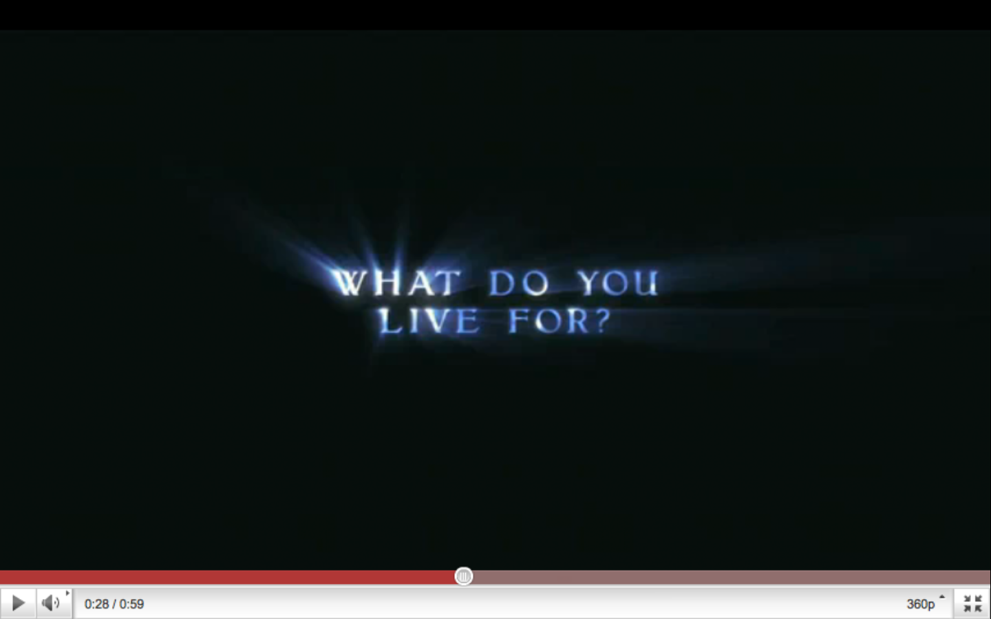
  • Fades to black with titles are used to build tension and also show a change in time or place. In the one below, the writing has the appearance of light shinning though, which may symbolise hope within the film, but also reminds of the film name 'Twilight'.

  • The opening shot of the tailer can be seen below. It highlights the loneliness of the characters alone in the woods, but also sets the scene. The woods are something largely associated with horror films and as a result the audience is lead to feel uneasy about the situation. A slow zoom and pan is used to show that these are the two people you should be concentrating on, also the man is a hugely recognised actor among the target audience. This is the followed by a close up with also backs up the fact that these two characters are important.


  • Shot reverse shot is used at times during the trailer to establish the relationship between characters. This gives us an insight into how the characters interact and also an understanding of their personalities. An example of this shot reverse shot can be seen in the screen shots below.


  • The sound during the trailer reveals the genre of the film it's self as action/sci-fi/drama. As the cutting picks up space the sound becomes more dramatic to emphasise this.


  • The screen shot above depicts a close up of the male character stopping a car with his arm. The close up emphasises this action and allows the audience to understand that this man is more than just human, he is stronger than cars and can also fly.


  • In the screen shot above we can see how the camera is angled down towards the girl, which develops the idea that the man is more important or is more powerful in this situation.


Week 3

I havent posted any updates to the blog for a while, as i mentioned in earlier blogs i've been concentrating more on the research rather than the generation of ideas. However, i have been learning how to do a lot more with after effects in terms of layer masks and motion tracking which have given me a couple of new ideas in terms of the trailer. I also learnt a lot about the titles and how to alter them in a 3D way, this is something i have not come across before and it will be important for the trailer. As for the poster and magazine front cover i am beginning to decide on picture framing and setting.

Toy Story 3 - Analysis

The toy story 3 teaser trailer is a much more conventional film trailer when compared to that of the dark night. Although the characters are all well recognised, we are still introduced to them individually in order to make the audience remember all of them. During the trailer character interactions are explained and we are comfortably lead to understand the genre of the film and what it is likely to be like. The camera shots and editing throughout the film is kept very simple and each aspect develops a deeper meaning. For example, the fade to black near the end is used to show a change in scene or time in the trailer. The deeper meanings of shots and framing are discussed below.

The link to the trailer can be found below:

http://www.youtube.com/watch?v=5f-MYl-HzNw


A screen shot of the opening shot of the trailer can be found above. The most obvious thing to talk about here is the depiction of the sky and the ground on the wall and the floor. This shows how for the purpose of the film, or for the toys anyway, this room is like the world. As well as that, it evokes the imaginative nature of the film, if the toys can come alive then the walls and the floor must be the ground/sky.


Throughout the trailer it is made evident that the character 'Woody' is in  charge. In the shot above we can see how woody is the most important thing character in the frame. Not only is her far bigger than the others, but he is closer to the camera as well, which exposes his important nature. In addition to all this all of the army men are looking up at him as if he is in charge.


The screen shot again shows woody to be in charge, he is telling everyone what to do and he is the only one that stays in the camera shot, rather than just walking straight through it like the other characters. The colours are bright and the light is also bright which helps to achieve the children's and comedy genres of the film.


The character in charge changes later on when we are introduced to 'buzz'. As you can see from the above screen shot the titles that buzz made are better than that of woody, and as a result they are made bigger and brighter to show this. Throughout the film this is the first time we see why all of the characters have been walking to the right hand side of the screen, this keeps the audience watching so they see what happens next.

The camera remains stationary for the duration of the trailer and it is always in the same standard poisition, this is done to emphasise the fact that everyone is walking the same way to the same place, but also to keep the audiences attention on the characters and dialogue. The trailer uses continuity editing throughout.


The screen shot above depicts buzz's titles to light up, which could expose buzz as a symbol of hope within the film, this is much the same with woody and everyone looking up to him. However, buzz seems to do everything better than woody and perhaps the way in which everything woody does, buzz does better, foreshadows the plot of the film and buzz being the eventual figure of hope, symbolised by the light in the screen shot above.

The competition between woody and buzz perhaps foreshadows eventual competition or disagreement during the film, which offers the audience a sneak peak into the film.

The trailer is under a minute long, much like the trailer to the dark night, this is something i will need to look into for my own production.

Tuesday, 21 September 2010

The Dark Night - Teaser trailer analysis

The first teaser trailer that i will analyse is the one for the recent batman film 'the dark night', it's quite a unique trailer and has some interesting meanings that are simple but effective.

A link to the teaser trailer can be found using the link below:

http://www.youtube.com/watch?v=UWw0ov-cAUg


  • The first major thing to mention about the trailer is that the footage shown doesn't match the dialogue over the top. They play a section of dialogue from the film over the top of trailer. This not only gives a sneak peak of the film, but also gives the audience a sense of mystery which fits with the film genre.
  • The trailer starts of very black, with just a few strikes of light, which could symbolise a deeper meaning of hope within the film, whilst also giving away the action genre.
  • One important thing to understand here is that the trailer only works because batman is a widely recognised film and people around the world see the logo and instantly know what it is. This means that it is down to the sounds and effects surrounding the logo which give a taster of the genre of the film and what it is about.
  • The logo is kept hidden to start with, just allowing the audience to see glimmers of the outlines. Which, as well as adding to the mystery of the trailer, keeps the identity hidden until the dialogue becomes more tense and builds up. As the trailer continues it becomes more and more light, as the strikes of light increase. These strikes reveal the action genre of the film.


  • In the screen shot above you can see how the trailer becomes lighter and lighter. In this shot, the light could symbolise the hope in batman, and may depict him as the hero. However this is a contrast to the fact that his logo is breaking down, which could symbolise his downfall. As well as all of this, the bits falling off the image are coming straight at the camera which puts us as the audience right in the centre of the action.

  • The way that as the batman logo complete breaks down the joker card comes flying towards to camera could symbolise that it is the joker who is to potentially bring the batman down. In the image above the futuristic style light effects reveals the sci-fi and futuristic angle of the film.

  • Right after the batman logo breaks down the screen goes black, which could evoke the sadness around it, but also go back to the mysterious nature of the film and add tension to the trailer.
  • The dialogue over the top is from famous voices that people will recognise, such as that of Michael Cain. The dialogue becomes more tense as the music begins to build, until finally the batman logo is fully displayed and the trailer is at its tensest moment. This building effect evokes the action genre of the film without giving too much away.


Developments

There hasn't been a lot of blogging happening over the past couple of weeks, but thats because blogger has been blocked at school which makes posting my analysis quite difficult. I've been saving them to word and as a result they will all be posted over the next week or so in a series of chunks. As for the idea, so far it has stayed the same and i've now seen a couple of shots and i've come up with a few story ideas that could hopefully work quite well, but for the moment i'm just concentrating on learning how to do certain effects and researching real media texts.

Monday, 6 September 2010

The Very Beginning - Day 1

The first thing to do is to research into current real life movie trailers and also magazine covers and posters, not only to establish the codes and conventions, but also to understand how different shots, angles and colours develop different meanings with the production as this is something that will be vital when it comes to my project.

I'm now starting to generate a few ideas for my production, i've chosen to make the teaser trailer with a poster and a magazine front cover. So far the main idea is a true story style film surrounding a sport, but as you can tell this is just simply an initial idea and as a result will probably change numerous times over the length of time we have to research and plan.

That's it for day 1 but i'll keep you updated with any new ideas or plans i come up with, but for the mean time i will concentrate on learning about current posters, magazine covers, and of course teaser trailers. My generation of ideas is likely to come during the planning stage.